1: Visual Appeal
The website needs to be visually stimulating. the first impression of the website is very important.
http://www.logocranium.com/
2: Interesting User Interface
It is important that the site viewer enjoys traveling throughout the site. The site must have good transitions and layouts.
http://www.miniusa.com
3: Primary Navigation Should Be on Top
The primary means of navigating the website should all lie on the top section of the site. This makes sure everything is easy to get to, and that the viewer can get to where he needs to be.
http://www.vw.com/en.html
4: Also Provide Navigation Tools in the Footer
Navigation tools should also be on the bottom of the site, so that people don't have to scroll back to the top. People are lazy.
http://www.puma.com/
5: Have Meaningful Content
Your site should have as little filler as possible. Make sure everything has a purpose. There is a phrase "content is king." Keep it in mind.
http://365daysofastronomy.org/
6: Contact Information
Make sure it is simple for people to find your contact information.
http://www.inspiredm.com/colour-schemes/
7: Search
Make sure there is a search bar on your site so that people can easily find specific things.
http://en.wikipedia.org/wiki/Wiki
8: Offer a Sign-up Sheet
Allow people to sign-up or subscribe to your site so that you can send them information and other things.
http://www.urbanoutfitters.com/urban/index.jsp
9: Cross Browser Compatibility:
These days, it is extremely important for your site to work with all of the popular browsers.
http://analog.coop/
10: Web-Optimized Images:
Make sure your images are optimized to be used on the web. People dont realize that not all images will work well on the web.
http://www.marylandsecurity.net/
Monday, January 23, 2012
Friday, December 9, 2011
Student Website Review
Billy Heemer:
Your page one is beautifully done. I love the Lightly colored circles in the top left. They really help to balance out the page in a very subtle way. All of your type is also very nice. I like how you have your name and "design.photography.animation" and a few pictures on the top right, and then your links to other parts of your project on the bottom left. The photo of the street is also pretty cool. Definitely nice work.
Natalie Bett:
I like the color of the background on your multi page. And I also think that the color of text compliments the background well. The fact that you put a little bit of information on the multi page is nice. Most people just put the three links, making the page very empty. Its also nice that you added a link back to the home page. I didn't even think about that, but now i wish i had. Nice work.
Tuesday, December 6, 2011
Artist: Paul Rand


Paul Rand is known for his many timeless logos, most importantly including IBM, UPS, Abc, Ford, Cummins, and Enron. He attended Pratt Institute, the Art Students League, and Parsons New School for Design. While in school, Rand developed what has come to be known as the Swiss Style of graphic design used by many designers even today.
In 1936, Apparel Arts magazine gave Paul the task of setting their page layouts. This was where his reputation first started to grow. His remarkable talent for transforming mundane photographs into dynamic compositions gave editorial weight to the pages. Due to his new found fortay, Rand was given a full time job and even offered the job of art director for the Esquire-Coronet magazines. After a year of putting it off (due to him not feeling he was ready for what the job demanded) he took over responsibility for Esquire. Rand was only 23 at the time. After that, he went on to design countless logos for major corporations, and also teaching at Yale University.
Thursday, November 10, 2011
Artist: David Carson


David Carson was born on September 8th, 1954 in Corpus Christi, Texas. Since then, he has lived in many places throughout the US and Europe. Carsons first exposure to graphic design came in 1980 in a two-week graphics course at the University of Arizona. He gained an interest in art, and later attended San Diego State University and also Oregon College of Commercial Art. As part of his Bachelor of Arts in Sociology degree, Carson was teaching a high school sociology class in Del Mar, California. He then went to Switzerland for a three-week graphics course, taught by Hans-Rudolf Lutz. Lutz was Carsons first major influence in the world of graphic design.
In the late 1990's, David Carson started to get some major recognition for his inventive graphics. Through out the 80's and 90's Carson worked as art director for various music, skateboarding, and surfing magazines. These included twSkateboarding, twSnowboarding, Surfer, Beach Culture, and Ray Gun. It wasn't until his work in Ray Gun (1992-95) that he gained worldwide recognition.
His work was full of distorted, mixed typefaces and fractured imagery, to the point that they were essentially illegible. In the later 90's he added corporate clients to his list: Microsoft, Armani, Nike, Levis, British Airways, Quicksilver, Sony, Pepsi, Citibank, Yale University, Toyota, and many others. David Carson was named one of the 5 most influential designers of all time by Graphic Design USA Magazine, putting him on the same level as Milton Glaser, Paul Rand, Saul Bass, and Massimo Vignelli.
Thursday, November 3, 2011
Artist: Milton Glaser


Glaser first formed Push Pin Studios with several of his Cooper Union classmates. His work is characterized by directness, simplicity and originality. He has been known to use any medium or style to solve the design problem in front of him. His countless book jackets, albums covers, advertisements, and direct mail pieces showcase his wide range of styles, from wildly primitive to avant garde.
Milton started his own studio, called Milton Glaser inc., in 1974. this led to an increasingly wide spread diversity of projects, ranging from the design of the New York Magazine, of which he was co-founder, to a 600-foot mural for the Federal Office Building in Indianapolis. Throughout his career he has made a huge impact on the world of graphic design, effecting not only people of his time, but generations to come.
Wednesday, October 26, 2011
Artist: GMB Akash
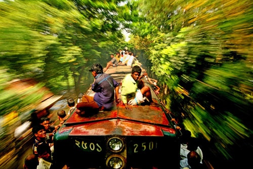


For years, GMB Akash has been traveling the world, capturing social issues faced by the people whom society seems to forget. He focuses on capturing and exposing the problem of the lesser known people of the world, mostly in his home country of Bangladesh. Through his photographs, Akash has shown countless stories of the socially isolated groups, making him known around the world as one of the leaders in documentary photography.
Over his years of work, Akash has received over 60 awards international awards from all around the world. His work has been in over 50 major international publications including: National Geographic, Vogue, Time, Sunday Times, Newsweek, Geo, Stern, Der Spiegal, The Fader, Brand Ein, The Guardian, Marie Claire, Colors, The Economist, The New Internationalist, Kontinente, Amnesty Journal, Courier International, PDR, Die Zeit, Days Japan, Hello, and Sunday Telegraph of London.
Wednesday, October 19, 2011
Artist: Brandon Rike


After high school, Brandon went on the road with his band. He spent his "college years" living in a van, traveling around the country, playing rock and roll for anyone that would have him. They even managed to get signed to a label in Seattle, and put out three albums. Over these years, he made friends with a number of bands, which allowed him to start designing shirts for more than just his own band. Somewhere around 2002, he began getting paid to design shirts. In 2006, his band stopped playing together, and Brandon started his full time career as a graphic designer. He has been designing band t-shirts ever since.
Besides band shirts, he does an occasional logo or poster. But his true love is in the shirt designs. he enjoys most "tweaking letters around, getting them just right, and being able to come back to it, some time later and still be tickled with my work."
Subscribe to:
Comments (Atom)